GEEKERY  
ADVENTURE  
CONTEMPLATION  

20141005

hanging the unhangable

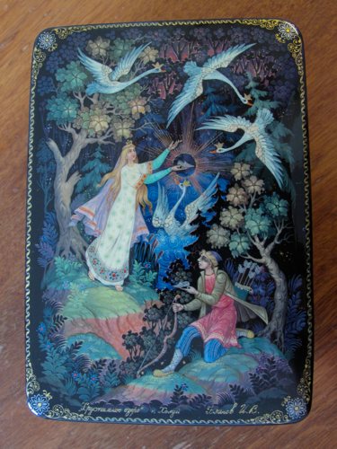
I have a collection of Russian lacquer boxes that depict fairy tales (in the Kholuy style, for those that care).  I originally saw these in a hotel while traveling in my family state-side.  For whatever reason, I became obsessed.  I love miniatures, boxes, and art generally, so I suppose it's not terribly surprising.  I found a the Tradestone Gallery sometime in college and honed my bartering skills as I purchases boxes over time. I've since become less fixated on acquiring boxes, but I still love the ones that I have.

For the past four years, however, they've remained in boxes because there hasn't been a good way to display them; we don't have much in the way of surface space.  I've considered various was of hanging them on the wall, but it is a difficult task to do so while not harming the boxes.  I've mused about using strong magnets to photo ledges, but nothing seemed to be both economically reasonable and aesthetically pleasing.

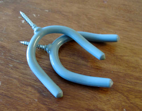
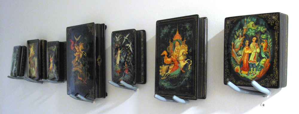
Finally, I stumbled upon tool hooks, which are cheap, stable, and don't get too much in the way of the boxes. This weekend, I picked up one for each box and mounted them on the wall.  NWC is worried about them rotating, and so I'm thinking of gluing them in place where they intersect the wall.

Aside from one wrong hole (the screw wouldn't go in), I think it went very well. 


20140916

professional face

I just redid my academic website, and I'm proud of the changes.  I stole design elements from Jaan, who used a modified Jekyll theme.  Before/after screenshots below, with old on the left and new on the right.  The CS web servers are going through a transition to a more secure system, so the changes won't be live for a bit.  I've debated getting a url for my academic webpage, or integrating it somehow with this blog, but I'm still not certain about what I want to do; it's nice to keep my personal rants and hijinks away from my professional front.


20140722

Daft for probabilistic graphical models

probabilistic graphical model rendered with Daft
Daft is python package used to render graphical models. Its renders are indeed lovely (see right), but the pipeline leaves something to be desired, and there's still a lot of functionality missing.

To try it out, I decided to draw one of the simplest PGMs possible: N points drawn from a mean μ.  It was frustrating to enter coordinates to place the nodes and plate boundaries. It would be preferable to specify which nodes the plates should surround, just as the edges specify which nodes they connect.  It would also be nice to not specify coordinates at all for the nodes, and instead have the system determine placement (but still allow manual override).

There are no options to control the alignment or scale of plate labels, and the concept of specifying an origin was a little strange, even if it makes sense.  The aspect ratio of the graphical model should be fit to the contents, and you should be able to set margins; the only time we should specify a size is when rendering.

While it seems promising, the learning curve is too steep for me.  I've entrenched myself in Inkscape, where it's easy for me to center things quickly.  Churning out the variant below took me about two minutes, whereas the Daft variant took closer to ten, and it still needs work.  That said, Daft does match fonts better with LaTex documents.  I could see it being powerful once you know how to handle its quirks.

probabilistic graphical model hand-drawn with Inkscape

20140213

Google fonts

Perhaps this is old news to some folks, but not being a regular web developer, I've only just discovered Google Fonts.  Find your fonts, link to Google, and edit your CSS—it's so amazingly easy. No downloads and no worries about compatibility. Why haven't I heard about it until now?  Is there something I'm missing?  Do people just not like fonts?  Silly question.  If anything, people in general love fonts too much.  I know I'm a glutton.

P.S. Drooled over Lettering: A Reference Manual of Techniques recently.

20131008

two clicks becomes three

Google Chrome recently updated.  Some of the changes are fine, but I don't like that they've hidden the "recently closed" tabs up in the menubar, which is a feature I use all the time.  The new tab launch page is now prettier, but it takes me three clicks (or actions, really since the second can be a hover), when it used to be two.  Also, the new actions require more mouse dexterity because the targets are now smaller. Screenshots of old and new below.  And yes, I still haven't removed the Google Reader bookmark.

old


newfangled


20121107

circle tile patterns

I like the traditional quilting pattern of overlapping circles, often called "wedding rings," but I've found that I like it best when the rings are thin; in other words, I like it everywhere except in actual quilts.

Today I was thinking that it would be very easy to use as a floor or wall tile, so I started digging around trying to find tiles that were essentially this pattern. Here's what I've found, vaguely in increasing order of favoritism.


Granada Tile's Athens-875Cannes-934 and Torino-937
(colors are customizable)


20120804

some more daydreams

Growing up, dad was always drawing floor-plans--It's possible he still does that, but I'm just not at home to witness it.  Anyway, he taught me to dream about interior spaces, and I'd thought I'd highlight some architecture and interior design-type stuff that's inspiring to me. First, I really like this porch:


And then here are some clever staircase ideas:


A space for four, providing each with a bit of privacy and ownership.

Can you tell I like maximizing the use of a given space?  Everything should have a place.  But then, there shouldn't be too many things in the first place.  Part of the architectural design game for me is balancing luxury and minimalism: you want to get exactly what you need to be comfortable, but no more, and certainly not enough to make upkeep a chore.

20120726

retina displays and serif fonts

Currently, it's accepted that serif fonts are better for print and sans-serif are better for screens.  Will retina-type displays shift font preference on computers to serif fonts?

20120223

customizing the google nav bar

I was really grumpy when Google updated their nav bar earlier this month.  I wasn't the only one, though it's hard not make a UI change without making at least someone a little grumpy; people don't like to change their workflow.  I complained in the usual ways: feedback forms, a google doc note to a friend that works there, muttering at my husband... I didn't like all the new search-y links (Ctrl+T is faster), I didn't like the new ordering, with my most used apps at the end, and I didn't like that Google reader was still missing.  So I cleared my cache to revert to the old settings and settled in for the siege.  We'll see who cracks first, Google.

Turns out I wasn't that patient, which isn't terribly surprising.  I downloaded a Chrome extension for modifying the toolbar and edited it, which took all of one minute since it's just javascript/HTML.  And voila!  Happy me!

Old:

New:

Extended:

20110916

inspiration

I'm not much for celebrity following or red carpet fashion, but I do read some photography blogs, and this image brought to my attention a beautiful (and exorbitantly expensive) dress and I wanted to see more of it.  I've been keen on wide necks for a while: they're elegant, but can still be modest (in more than just the LDS sense).  I also like chiffon, and I've been trying to come up with a way to use both in a dress design for a while; I might just end up copying this to some extent.  Beading can be kind of showy, but in this case it's what pulls the two elements I like together, and it's also what takes a simple, comfortable dress and makes it red-carpet material.  Not like I'll be needing red-carpet worthy clothing any time soon.  Anyway, I've made it a goal to design and sew a dress by the end of next summer; we'll see if this influences that design.  Or if I actually accomplish the goal, for that matter.

20110524

designing everyday things and computer interactions

I've been reading The Design of Everyday Things by Donald Norman.  It was originally written in 1988 and my edition was revised in 2002, but it still retains archaic examples like electronic land-line phones without screens that were in common use around the time of the original writing.  The author also used visicalc as an example of spreadsheet software and referenced the Xerox Star and the Apple Lisa as failed personal computer designs.

Despite a few of these examples (which are no longer "everyday"), he does make some good points, namely that the principles of good design are visibility (to determine the system's state and possible actions), a good conceptual model (so the user develops a coherent idea of what's going on and why), good mappings (knowing what physical movement performs what system action), and feedback (informing the user about the results of actions).

When I got to the section on computers, there was a subsection titled Two Modes of Computer Usage.  Norman described commands as either "third-person" and "first person," the former being issuing "actions" from a command line and the latter being GUIs (although he never used that term since the book was written before it became a common acronym) like games and spreadsheets.  I don't really like this terminology as it is arguable inaccurate.  No matter what, if you're interacting with a computer, it's first person.  Maybe if you were tunneling to another computer it might be "third person," but even then your commands don't change at all.  Norman made the distinction by saying that using a command language feels more like you asking someone else to do something, whereas inputing data into a spread sheet feels like you're doing it yourself.

I guess my conceptual model (to use his terms) of the computer varies from his (which isn't surprising given the generation gap), but in my mind, the 1st and 3rd person terminology should work the other way around if you have to use it at all.  On the command line, you say piece by piece what you want done, whereas in a GUI, you let "someone else" take care of the details for you.  Lower level is more direct.  GUIs simply mirror physical interactions, which is why they feel more like direct interaction at first.

Then, when you want to move your clipart a little to the right and the word-processing software won't let you move it exactly how you want, you'll realize that it's not quite like the physical world.  Problems like these are design flaws stemming from the premise (or conceptual model) that interacting with the computer is like interacting with things in the physical world.  While text-command interactions are harder to learn, they are less prone to these flawed conceptual models.  The history of graphical computer interaction is one of constantly trying to make it more like the physical world.

GUIs and command line interactions both have their purposes.  I'd never want to do digital art with a command line.  (Well, not never.  I might actually prefer a scripting interface for things like cropping, scaling, color adjustment.)  But listing the contents of a directory, moving files, or compiling software?  Command line, please.

20110415

fashion, functionality, and aesthetics

On Monday I watched The September Issue as part of a lethargic end to an otherwise busy day.  It follows Anna Wintour, Vogue's editor-in-chief, and some of her associates--editors, designers, photographers, etc.--as they put together the September 2007 issue.  I know I'm way behind the times as this movie came out in 2009, but so it goes.

It starts off with an interview quote from Anna (my own transcription):
I think what I often see is that people are frightened of fashion and that because it scares them or makes them feel insecure, they put it down. ... On the whole, people that say demeaning things about our world, I think that's usually because in some way they feel excluded or--you know--not part of the 'cool group' or ... so as a result, they just mock it. ... Just because you like to put on a beautiful Carolina Herrera dress or a--I don't know--or a pair of J Brand blue jeans that, you know, instead of something basic from Kmart, it doesn't mean that you're a dumb person. ... There is something about fashion that can make people very nervous.
This opening hit me very negatively.  It felt like the middle school rant of an elitist.  (For reference, the cheapest Caroline Herrera dress I could find online was $495, but most of them were in the range of just under $2,000 to just under $4,000.)  Throughout the documentary, it because clear that Anna received little support at home. Her own daughter implied that fashion wasn't terribly important to her and planned to go into law.  Anna also said that her three high-achieving siblings (a political editor, a deputy-general secretary of the Public Services International union, and an official on a local council who works in low-income housing) all thought her work was "amusing."

I think Vouge is pretty to look at (at least the few times I have) and I'm sure the general population gleans tidbits for daily use, intentionally or not.  For me, I really don't like changing my wardrobe constantly.  I might combine clothes in new ways, but I'll rarely buy anything new.

Clothing, along with other elements of fashion and design, has two main components: functionality and aesthetics. Arguably, aesthetic appeal is a function of an object, but I'd like to distinguish them for the sake of this exposition; an item is functional if it is easy to obtain, maintain, and use.  While functionality is slightly subjective, aesthetics is mostly subjective and varies in importance depending on the person and item in question.  For every individual, they maximize the combination of functionality and aesthetics; for Anna Wintour, aesthetics of clothes is obviously a very high priority.

I'm a very visual person and care greatly about how things look: my clothes, my house, my car, my food.  Luckily, I've developed a minimalist bent, which ends up being fairly functional as well.  For instance, when I was searching for a simple white sugar bowl, the cheapest Target-brand one was exactly what I wanted.  It doesn't always work out quite so nicely, though, and sometimes I have to settle.  I guess what I'm getting at is that aesthetic appeal of an object is worth considering; valuing it "doesn't mean that you're a dumb person" as Anna Wintour said, but it's important to acknowledge that others have different value systems and also to know yourself and develop your own balance.

20110316

the athletic look

I saw a couple today.  They were running down the sidewalk in normal street clothes, but it was apparent that they were exercising, if only because they were wearing running shoes, they didn't look like they were stressed, and there wasn't anywhere to go in the direction they were headed.  It got me thinking about two things: how we use clothes to explain our actions to others and how uncommon it is to exercise in our daily lives.

I know there are advantages to specially-made athletic clothing: it can breathe better, wick sweat, allow freedom of motion, and provide needed support.  However, I think that often times people buy it simply for the look and feel, both of which are valid reasons.  If you feel the part, you're more self-confident and likely to push yourself harder.  If you look the part, people aren't going to think you're in trouble, late, or just crazy--it's a social signal.

When I fenced, and especially when I taught fencing one summer, I felt the need to buy loose-fitting athletic pants.  They were perfect for fencing (and all sorts of other activities--I still have and love those pants), but I'd be lying if I said that those pants didn't help me feel comfortable carrying equipment through a mall full of people every week or keep control of a class of armed eight-year olds.

It also struck me that manual labor and fitness are now often relegated to hobbies instead of integrated with everyday life.  People aren't churning butter, grinding wheat, or whisking eggs by hand.  People aren't building barns, clearing fields, or cutting stones.  (Okay some people do these things, but if they're in the States, they're probably either professionals assisted by technology or Amish.)  It's funny that someone will use an electric beater and then lift weights to strengthen those same muscles the next hour.  I think it'd be really interesting to design a workout system that consists entirely of activities in which the primary goal was not fitness-related but some other productive task.

20110126

building blocks of dreams

Recently I've been struck by several photographs, blog entries, and websites, all relating to interior design to some degree.  I'd thought I'd share them and muse about some dreams for potential interior spaces.

First, a selection of interior photographs by Don Freeman:


I love the use of wood and color, the mixed levels of simplicity and complexity, and the liveable feel of these spaces.  They are real spaces explored through photography, rather than picture-perfect poses.

Next, I stumbled on the work of Jennifer Post, who designs high-end minimalist spaces.  She's quoted in the NYSD as saying, "I always tell my clients this is a Bentley car – it’s not a f***ing BMW. It’s got to be a Bentley." I like the look of her work, but it's accomplishable without the Bentley price.  Keeping it clean, however, might require an army of perfectionists.


In the spirit of white and brown, I liked looking at this kitchen:


And finally, there were a few specific pieces that I particularly enjoyed: Flora Grubb's wall garden and hanging terrariums, and the Gary Weeks Rocking Chair.


In general, I think I like dark woods and very light or dark/rich walls--high contrast spaces are compelling.  One thing that I saw in a home once was a wall with very fine stenciling in shades of white; I'd like to try that someday.  Our bedroom is currently high-contrast like many of the above photos: light blue, light brown, dark brown, and near black.  Our living room is very middling, as is our kitchen, but the latter is harder to control in a rented apartment.  I'd love to have wood floors wherever we live next, but we'll probably stay in grad housing, which means linoleum doom...unless I break down and buy the faux wood flooring from Ikea, but I'm not sure if it'd be worth it.
Interior spaces are difficult to fine-tune, especially on a budget.  In this case, evolving towards a goal can lead to some pretty hideous consequences if one is not careful; everything needs to match with both the present and the eventual goal, which isn't always possible if one is revamping the entire look of a space.  Most likely we'll make the biggest changes when we move, since we'll have to tailor our decor to the new location anyway.  These changes are far off, but it's a semi-constructive day dream for now.